FatCow Is Proud To Be Green!

By Jessica Ann
August 14, 2014

Here at FatCow we realize how important it is to live an eco-friendly lifestyle, which is why all websites hosted with us are completely powered by wind energy. In fact, for each kWh of energy used to power your website,  FatCow buys twice that amount in Renewable Energy Certificates (RECs), offsetting your site’s energy usage by 200%!

Globe Goes Green Icon Final

What are RECs, you might ask?
Although we can’t produce wind energy onsite, we’re able to purchase RECs to compensate for our energy use. Each REC we purchase represents 1,000 kWh of energy produced naturally, thus reducing the amount of fossil fuels  circulating throughout the energy grid.

With your help, FatCow’s commitment to the environment will prevent 999 metric tons of carbon dioxide from being released into the atmosphere this year alone! That’s equivalent to planting 213 acres of trees or taking 196 cars off the road.

Be Loud and Proud About Your Green Site!

You have a choice where to host your website, and with FatCow your choosing to host in an environmentally friendly data center. Make it known by adding a green badge to your website — it will increase your appeal to eco-conscious customers visiting your site and it will help to build your reputation as environmentally responsible.

hosting-badge-6hosting-badge-5hosting-badge-4

To learn more about your eco-friendly hosting plan, make sure to visit FatCow’s feature pages for Shared Hosting, VPS Hosting, and Dedicated Server Hosting.

How do I configure Outlook?

By Jessica Ann
August 11, 2014

There are about 515 million results when you search Google for “how to have fun.” It’s safe to say that “configuring Microsoft Outlook” isn’t on any of those lists or how-to articles. Whether you are setting up a new computer at home or dealing with a hard-to-reach IT department, chances are you’ll eventually find yourself staring at an empty Outlook settings screen. When that panic sets in, and you find your self asking “How do I configure outlook?” it’s time to read this article.

mail

Automated Exchange Email Setup in Outlook

If you need to set up an Exchange account in your Outlook, or you don’t know what that means, try this method first. Open Outlook to get started. It may display a setup wizard. Click Next to begin, and Next again to move on to the E-Mail Accounts page. Make sure your name and email address are correct. You may need to add your name or change your email address if you used a different one when you first set up your computer. Click Next to let Windows try to setup Outlook automatically.

Now, you may have been thinking that by “automatically” Outlook means “automatically.” Unfortunately, you and I probably have a different definition of “automatically” than Outlook. You’ll be asked for your username and password while the setup is in progress. “Username” is a confusing name for what Outlook wants, because it’s really asking for your email address again. Be sure to use your entire email address as your username, including the domain, like .com.

Enter your password, click Next, and you should see a “Congratulations…” message about how your email account is now ready to use.

If something goes wrong, or Outlook tells you it can’t set up your account automatically, you’ll need to add it manually. We suggest sighing audibly to vent a bit of your frustration. Then close Outlook and we’ll try it the manual way.

Manual Email Setup for Outlook

Okay, take a deep breath to relax after that frustrating non-automatic automatic setup process from earlier. Click the Windows Start button and then Control Panel. Click the Mail icon or, if you don’t see the icon, press Control + F and type Mail to bring up the icon, and click it.

Next you’ll have to click Email Accounts and, on the next screen, New. Now look for Manually configure server settings… to choose the email type. This time we’re trying Internet E-mail, so click that button and then Next.

Right about now you should be seeing just how important that automatic setup can be, and how justified your frustration was when it didn’t work for you. But let’s keep moving forward. Remember, deep breaths. They’re key.

The next screen is (hopefully) where the magic (finally) happens. Enter your name and email address. Select IMAP from the drop-down under Server Information. Your outgoing server is smtp.fatcow.com if you’re configuring for your FatCow account, and your incoming server is pop.fatcow.com. Your username will be your full email address, like above. Enter your password and then click the More Settings button. On the Outgoing Server tab click the Use same settings as my incoming mail server checkbox. On the Advanced tab set the Incoming server port to 993 and the Outgoing server port is set to 465.

Finally, click Next and Outlook should test the settings. If you entered everything correctly, you’ll be ready to start emailing. If the test fails, feel free to sigh audibly gain, and double-check the instructions. You’ll be done configuring Outlook in no time.

Getting Started With FTP Settings

By Jessica Ann
August 4, 2014

Maybe you haven’t had to bother with FTP settings yet. And you just want someone to tell you what the heck they’re about. Or maybe you’re reading this with an FTP program open in another window of your computer – so you need to learn about its magic, pronto.

Wired to FTP

Here’s what it’s about:

An FTP server is just a computer owned by your hosting company which stores the files used on your website. An FTP client is a program used to upload and download files between your computer and an FTP server. FTP settings are a set of values you’ll need to use to connect an FTP client to an FTP server.

But Seriously, What the Heck Are FTP Settings?

Let’s start with what FTP stands for. For The People? Frequently Tripled Profits? Fairly Timid Puppies? Nope, luckily it doesn’t mean any of those things…although we wouldn’t object to frequently tripled profits.

FTP actually stands for “file transfer protocol”. It’s used to transfer files between computers, most commonly a home computer and remote website server. FTP is a way to upload files from your computer to your website, and vice versa.

FTP allows you or your designers to make changes to your site (either with images or web pages on a home computer) before placing them on your public website – where the world can see them. There’s nothing worse than writing some great copy for your home page, hitting publish, and only then suddenly noticing you’ve misspelled the name of your business. FTP adds one more layer of review.

The most popular way to manage files via FTP is through a dedicated FTP client, which is a piece of software built to connect to and manipulate the files on an FTP server. Read about how to use FileZilla, a free and easy to learn FTP client here: (http://www.fatcow.com/knowledgebase/beta/article.bml?ArticleID=1393_). Once you’ve entered your FTP settings into the client, it enables you to point and click to perform most of the file management you need to do.

Getting Started with FTP Settings

All FTP accounts have a few basic settings you’ll need to know in order to connect. Your web host should make these easy to find. If they don’t, you should probably move on over to FatCow, where the FTP settings can be found easily [here](http://www.fatcow.com/knowledgebase/beta/article.bml?ArticleID=201).

The first setting you’ll need is the server address, usually ftp.YOURSERVER.com. FatCow users can find their FTP server at ftp.fatcow.com. This setting tells your FTP client where to look for connections.

But you’ll still need to provide login credentials before you can connect. Your FTP username and password are the same as the ones you used when you opened your hosting account. FatCow users can set the port to Port 21 and make sure Passive FTP is set to Enabled.

This is all you need to get started. If you’ve entered your FTP settings correctly, you can connect and start moving files back and forth. If you have trouble, try entering your settings again. You can also use the [FatCow file manager](http://www.fatcow.com/knowledgebase/beta/article.bml?ArticleID=1703) as another solid resource.


Solving Common Password Woes

By Jessica Ann
July 28, 2014

Screen Shot 2014-07-28 at 9.54.34 AM

If you’re looking to change your password, keep in mind that FatCow places the security of your account above all else. We provide options for setting a secure password, retrieving a lost password and establishing a security question. If you adhere to these requirements, you’ll have a strong password and your account will be more secure.

Minimum Password Requirements

To change your password, first log into your account. Once you are logged in, head to the [Password Change](http://www.fatcow.com/secureControl/PasswdChange.bml) page. There you can choose and confirm a new password for your account.

If the Password Change form won’t accept your new password, make sure it adheres to our requirements for strong passwords. Strong passwords have several mandatory (and often highly annoying) elements:

  • 6 or more characters
  • 2 or more numbers
  • 1 or more special characters, including !@#$%^&*?_~,./<>-=+()[]{};:`|\”‘
  • 1 or more uppercase characters
  • 1 or more lowercase characters

In addition to the above requirements, FatCow prohibits the use of your username as well as any of your 5 previous passwords. If your first attempt to change your password was rejected by the form, check the above requirements and try again. As long as you fulfill all of the above, your new password should be successfully set.

Screen Shot 2014-07-28 at 9.49.47 AM

Beyond Password Strength Basics

But if you want to be even more secure, consider going beyond the minimum requirements. The six-character minimum is just a starting point. When it comes to passwords, the more characters the better. A very secure password consists of 8 or more characters, with 2 or more special characters, in addition to a mixture of uppercase and lowercase characters.

If you want something relatively easy to remember without the insecurity of using actual words or phrases, replace some letters with easy-to-read symbols. For example, @ for a, 1 for I and O for zero. Avoid self-referential words or phrases that many people may know, like the name of your street or your pet.

You can go one step further for maximum security by creating an account with a password management service like [1Password](https://agilebits.com/onepassword/mac) or [LastPass](https://lastpass.com/). These services provide web interfaces, desktop and mobile applications you can use to generate and recall extremely secure passwords, eliminating the temptation to use one easy-to-remember password across all of your accounts.

Setting Your Security Questions

Take your account security even further than a secure new password by resetting your security questions. Log into the control panel, select the Account Information menu option and click Set Security Question. Change the security question for your existing profile by clicking the Existing Profile button and then choose a question.

Once you have entered your answer, all you have to do is save. You have updated your password, meeting or exceeding our security requirements. And you’ve added an additional obstacle for would-be hackers. Now you can get back to building a stellar website.

The Future of Websites

By Jessica Ann
July 22, 2014

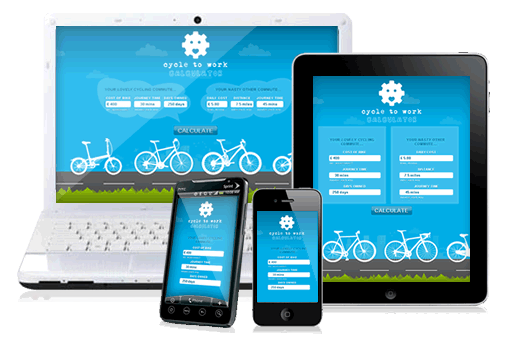
Striking a balance between visually engaging content and customer-focused context is crucial for the future of any website. Responsive web design is key to this balancing act. It adapts to the type of device and the screen size on which it is viewed. This means that your content automatically reorganizes to optimize for a specific context.

The-Future-of-Web-Design

Nuance required 

Media queries are CSS (cascading style sheets) determine how content is laid out in a responsive design framework. The data from media queries gets optimized for each individual viewer.

For example, a media query will tell you whether a page is being viewed on an iPhone 5 or a smaller screen. That simple data point tells you how much of the main content on a page will be visible “above the fold,” or without the need to scroll. Many websites display a large top section on desktop browsers, full of navigation menus and full-bleed graphics. If your site does the same, you can use a media query to display all of that at the bottom of the page. This prioritizes main content like blog posts.

Designing Beyond Screen Size

In the web design world, responsive web design is described as optimizing the content for context. Contextual web design caters to each user’s situation. But truly contextual web design is about more than just screen size. Location, device type, and time of day are just a few examples of data points which provide a far richer context when used together.

Media queries don’t provide designers with enough creative license. Instead, you can use a more a simpler CSS component, the class. A class in CSS is a way to reformat a common element by making it part of a subgroup. So if images fill the screen by default, a class can be used with the image element to prevent that behavior on mobile devices.

Revised-Marketing-Responsive-Banner

Looking Forward to the Future

The future of websites is the focus on context – more than the current media queries allow. This is not a new idea. If you Google alternatives to media queries, almost five million results appear. But implementation requires you to do a lot of work up front to get to know the contexts in which your audience finds your work.

Once you have at least a few common contexts, you can begin to look at these and other ways to move beyond media queries. This lets your creativity shine, and allows you to focus on people and not devices. Once you shift your perspective, your website can shine into the bright future.


5 Calls to Action to Use on Your Website

By Jessica Ann
July 16, 2014

A great website drives engagement with a call to action, which is a clear and direct suggestion that the visitor do something. The best calls to action offer to trade useful information or tools for the visitor’s future attention. Fat Cow’s Marketing Services packages can help you set up a boldly designed presentation. But you’ll want to think about your approach before you start designing. Here are 5 calls to action to use on your website:
call-to-action

Subscribe to receive new blog posts by email

Use an email subscription call to action to reach visitors who may be interested in your content but may not visit your site every day to check for updates. An email subscription form can be as simple as a text box or entering an email address and a button that says “Subscribe” with a brief description explaining that you’ll only use the email address to send the visitor new posts.

While your site’s top header and sidebar are both good spots for an email subscription form, consider placing the call to action at the bottom of each blog post, as well. A call to action at the bottom will reach visitors when they have just finished reading. If you’re producing engaging, high-quality content, that’s when your readers will be most open to getting more of your good stuff.

Download a free e-book

We know you provide visitors with great content, and you know it, too. But there will always be some visitors who prefer not to receive notifications whenever you publish something new. That’s okay, but you don’t want to ignore those people. Instead, offer them a one-time trade: in return for signing up for your general mailing list, provide a free ebook download.

People who are averse to yet another email in their inbox every day or week may not be so averse to a one-time, free download. Of course, you have to make sure the ebook you’re offering is interesting and aimed at driving people back to your site for more great insights. HubSpot takes things one step further, by presenting a call to action offering a download of… an ebook about calls to action.

Exclusive access to something free

People love to be a part of an exclusive group. Offer them something unavailable to the world at large. For example, offer exclusive content only to your site’s subscribers. Content that non-subscribers will never see can increase the chances that people will sign up. Of course, this means that your content should be top notch.

Remember it’s not necessarily the quantity that makes such an offering effective. It’s the exclusivity itself. Base your exclusive offering on your main content, so every visitor to your site is open to the possibility of becoming a subscriber.

Follow on Twitter

This is an easy way for someone to signal interest in what you’re doing. It’s also easy for you to facilitate with a simple button on your site. Again, someone’s presence on your site is a signal they are interested in what you have to say.

And if they’re a Twitter user, it’s probably easier to keep an eye out for your Twitter posts in their timeline than to come back to check your blog every day. Of course, if you share interesting links on Twitter and sprinkle in links to your new posts there, your Twitter followers will end up back on your site eventually. Whatever you’re writing or selling or promoting, include this call of action in a prominent position on your home page.

Pin a picture to Pinterest

The one thing people like more than free and exclusive stuff from you is being the source of cool stuff for their peers. A little bit of code can make every image on your site shareable. Pinterest drive a lot of traffic, so it’s worth considering integration.

This will work best if your site features big, beautiful photographs. The Pinterest code snippet will place a small “Pin It” icon in the bottom-right of every image. From there, visitors can share your site’s photographs with their Pinterest communities in just a few clicks.

No matter what call to action you choose, remember to make it a prominent part of your home page. It’s even better if it provides your readers with irresistible content.


Changes In Google Authorship Faces

By Jessica Ann
July 14, 2014

Authorship Faces will no longer appear in search results for logged out users. This used to be a great way to connect your face or your business brand to search results. But it’s not the end of the world.

Google-Authorship

What We Lose Along With Authorship Faces

Prior to the June changes, your Google+ profile photo appeared alongside highly relevant search results whether a user was logged in or not. Businesses could similarly use Authorship markup via [Google My Business](http://www.google.com/business/) and place their logo or other branding next to results. Those who aren’t logged into Google will no longer see those profile photos or logos. This removes one aspect of brand awareness. This is unfortunate if you were only relying only on Google Authorship to build your brand.

There’s More to Authorship Than Faces

Google Authorship Markup (https://plus.google.com/authorship) is much more than photos. Bylines can be powerful even when someone doesn’t recognize your face and (as of right now), bylines aren’t going anywhere. Unlike photos, all you need to get a byline next to your results is correctly implemented Google Authorship Markup. In other words, there’s no need to be in the user’s Google+ circles as with photos.

Google is Your Friend (Yes, Even Yours)

Google’s interests overlap with ours in at least one important way: Google wants more people to use Google. The company makes changes to search results to improve user experience and engagement. It also provides robust tools for publishers and authors.

Of course, many users would like to see Authorship Faces remain as they were before. But Google had good reasons for removing them. These reasons include a move toward consistency across platforms, the scarcity of display space on mobile devices and minimal difference in click-throughs between SERPs with images and those without images. If that last one sounds counterintuitive, read Mark Traphagen’s theories on it [at SearchEngineLand](http://searchengineland.com/google-removes-author-photos-search-mean-195236).

So we may not like the removal of Authorship Faces, but Google knows better than anyone how to get relevant results clicked. Our focus as content producers and brand builders remains on consistently publishing high-relevancy material. Photos or not, the top result predictably [gets the most traffic](http://searchenginewatch.com/article/2276184/No.-1-Position-in-Google-Gets-33-of-Search-Traffic-Study).

As Ray Hiltz points out [at SteamFeed](http://www.steamfeed.com/authorship-faces-disappear-google-search-results/), logged in users may see your photo “if you’ve established a relationship with them on any Google product including Gmail.” Authorship Faces were only removed from search results displayed to users who weren’t logged into Google. That means you should still keep an eye on your markup, and continue to build your Google+ network.

One case study found some interesting data about how logged in users interacted with a specific website. Ryan Jones of dotCult found it may be worth it to optimize for logged in users. Here’s what he [reported](http://www.dotcult.com/google-loggedin/):

  • Logged in users had twice as many pageviews per session and spent twice as long on site
  • Logged in users had an almost 0% bounce rate, as compared to a 50% bounce rate overall
  • Logged in users were 20% more likely to be a repeat visitor

A case study is just that: one person’s report on how people engage with his site. But it’s a good illustration of why you can’t ignore Authorship Faces. Google Authorship Markup is still an important foundation for any SEO strategy.

How Long Should it Take to Get a Good Logo?

By Jessica Ann
July 11, 2014

A good logo has to convey your company values, your product’s purpose and a recognizable image. That’s a tall order, and most companies will want to seek a designer with…design experience. Any designer with experience will be able to answer how long it should take to get a good logo. But it helps to be informed first.

blue-clock-icon

Reap What You Sow

The answer to the question in the headline is “as long as it takes.” A great logo is like a garden. There is no single moment of “gardening” that produces a tasty vegetable. The garden plot has to be planned. Measurements, soil preparation and seed planting all come before watering, weeding and harvesting. There are no shortcuts to great-tasting veggies.

A logo is no different. It isn’t simply a single act of design in a vacuum. How long it takes will depend on all sorts of factors. You can’t build a garden for someone unless you know how much space they have, where they live and what they want to grow.

Logo design requires discussions with the client about their company, their philosophy and their goals. Pre-existing brands may want to preserve color palettes or other elements. They may want to go the other way completely, excluding aspects of their business the designer may include if they aren’t told. If you want to harvest your best logo, you’ll need to put in the time to plan, plant and water it.

Plant Food For Logo Design

If “as long as it takes” just isn’t doing it for you, try this one instead: a good logo will take as long as you allow it to take. In other words, turnaround is about more than just a graphic designer in a cubicle. It’s a conversation. The more available you are to the designer for feedback and the more up-front guidance you give on what a good logo means to you, the faster the process will be.

The Internet enables easier communication than ever before, and modern bandwidth makes it easy to send large files such as high-resolution images back and forth. Services such as 99Designs will crowdsource your new logo based on initial specifications. Competition between designers drives quality up, and seven days after submitting your design brief, you can pick a winner.

A quick search for “logo design services” proves there is a large market for logo development. Maybe crowdsourcing isn’t your preferred solution. That doesn’t limit the power of communication over the Internet. Large file transfers, video chat and powerful remote project management tools like Basecamp can accelerate even the most in-depth design process.

So, when it comes to deciding how long it should take to get a good logo, the answer is unique to each company. The trick is for each client to take their logo seriously as a lifetime commitment, and for the designer to treat each logo like the first and most important one they have ever designed.


How to Simplify Your Design Navigation

By Jessica Ann
July 9, 2014

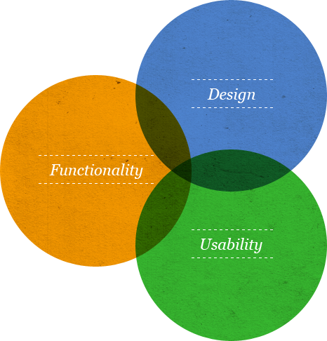
We’ve all dealt with a website that has a million menus and submenus with no clear sense of organization. It’s the last thing you want to do to your own site’s visitors, so it’s important to know how to simplify your design navigation. Usability is so important for web design, and it starts with making it easy to navigate a website.

design-usability-1

Have a Plan

A very popular YouTube video about the game World of Warcraft went viral because while it begins with a very calculated, carefully laid-out battle plan, it ended with one of the players simply rushing into the battle blindly, getting everyone killed. The offending player also died, and everyone on his team was very angry with him.

The lesson is clear: if you don’t have a plan, you’re not going to get very far. And your failure is going to make your team, which can include both colleagues and customers, very angry with you. So if you’re building a big website using a website builder, WordPress or some other content management system, plan it out first.

While it may sound strange, the best place to start planning your design navigation is a blank piece of paper. Even if you haven’t selected a website design yet, you can probably predict what types of content you’ll want.

The sweet spot you have to find requires offering visitors easy access to what they’re looking for without cluttering the page and taking attention away from the content itself.

Keep Priorities in Mind

Place the most important pages in a primary, usually horizontal menu at the top of the page. This may include your blog, an about page, and a contact information page at minimum. The fewer the better when it comes to this “main menu.” If you offer a product or a service, a pricing item should also appear in the primary menu.

Use drop-down or menus to include related items with each primary item.  A drop-down menu appears when someone hovers the mouse cursor over the primary item. For example, the “about” menu item may reveal a vertical list of links to related pages like company history, employee biographies and mission statement.

Don’t Fool Your Visitors

Some sites make the primary items impossible to click, forcing visitors to find out the hard way that they need to click a sub-item. Don’t make this mistake: simplify your design navigation by allowing visitors to click on all levels of a menu item.

In the above example, clicking “About” should bring up a main page about your company. Sub-items may be placed in a sidebar menu, conceptually connected to the main menu with similar styling, such as color and typography.

In fact, styling can also be used to make it obvious at all levels of your site where exactly a visitor is at any moment. If someone is reading the Company History section of your About menu, those two items should be highlighted somehow, whether with bolded text or with distinct coloring. Think of this styling like a web page version of the “You are here” dot on a shopping mall map.

There are certainly more complex menu systems for those who need them, but those can also be done simply with these basic principles. The key to figuring out how to simplify your design navigation is to put yourself in the position of your visitors. Think about what they want to see and do, and what you want them to see and do, and you’ll be on your way to a simple and effective design navigation.


Writing a Compelling “About” Page on Your Website

By Jessica Ann
July 7, 2014

If your small business has a website, then the “About” page is a critical component that shouldn’t be overlooked. If you’re like many business owners, you’re probably so focused on the design of your site that you don’t see the importance of the “About” page. You may even view it as an afterthought, forgetting the value of it.

FAQ

Your “About” page is likely to be one of the most visited, and among the highest ranked pages on your website. It’s the place where your visitors have the opportunity to evaluate you and judge your credibility. You may not be paying too much attention to it. But your visitors are and that’s why you need to pay it the respect it deserves. A little TLC lavished on your “About” page can go a long way towards making your site and business memorable. This will make people want to find out more about what you can provide.

The “About” page is a one-off opportunity for you to tell your story, explain what your business is about, let people know what you can do to solve their problems and what makes you unique. Every “About” page should be unique so there’s no one “fits-all-sizes” template that works for all types of sites.

Here are some basic rules to keep in mind as you create your own memorable page:

Add some personality – This isn’t your résumé or your LinkedIn profile so don’t just focus on a list of cold facts. Add some personality to the mix. Adopt a conversational tone as if you were speaking to your reader face-to-face. Show that real people run your business by adding images of your team and maybe a short bio. If you want a good example, take a look at Mailchimp’s ‘About’ page. They use simplicity and humor. This is a winning combination that exudes personality.

Show your passion – You love what you do – communicate your passion to your visitor. Tell them what your values are, why you started your business, what your mission is and what makes you different.

Get to the point – Your visitors are on your site to discover if you can do something for them. Don’t bury your Unique Selling Proposition (USP) half way down the page after you’ve told them your life story. They might not get that far. Shout it out up front like the guys at Copyblogger do.

Get Social – Show how you love connecting to customers by adding links to your social networks. Encourage visitors to connect and interact with you in all of their favorite online haunts.

Let your customers do the talking – Don’t be shy – if you have had recommendations and testimonials from existing customers then tell the world about them. Highlight any awards that your business has received or any press coverage you’ve had.

Don’t forget the basics – the who, what, where, why and when of your business should all have a place on your page. Make it easy for visitors to contact you and to ask questions.

Call to action – Tell your visitors what they need to do next. If you want to add them to your mailing list then add a subscription link. Point them to a specific landing page if that’s where you want them to go.

Be responsive – Remember that the Internet has gone mobile crazy when you consider your design and that your “About” page needs to look good on all types of devices.

Do you want your website to be a memorable and passionate personal statement? Don’t make it about you. Make it about your customer. And make it happen on your “About” page.